Contempo theme? Customized!
As you have probably noticed, I managed to customize the blog's looks a little bit.
I haven't sorted out the issues described in my previous posts but I made some changes to handle at least one of them.
This wasn't a solution but a workaround which I can live with.
My main issue was the ugly almost empty side bar with two collapsed widgets. As I chose not to show my profile on it, it left a large chunk of space uncovered in the upper left corner of the page.
As the sidebar can be seen expanded on larger screens only, I've decided to keep it as it is and do something about that uncovered space for the profile.
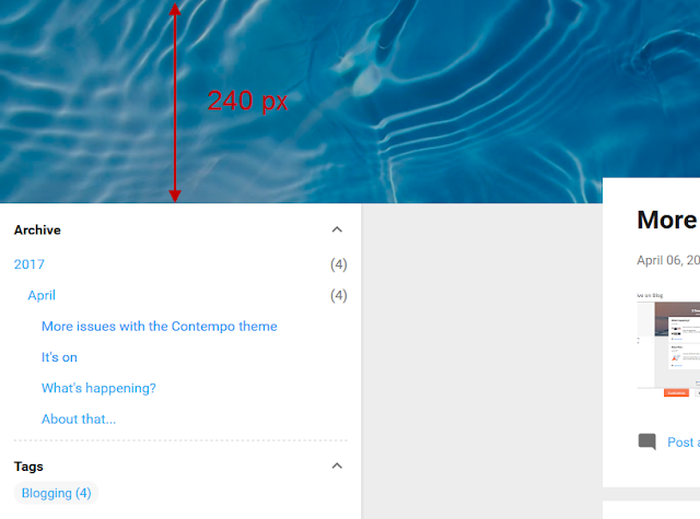
The thing is that the sidebar consists of the top sidebar and bottom sidebar, and the former is as high as the background image (which is 480 px by default in this theme.)
So I reduced the height of the background. But here is the thing, you can reduce it to as short as 420 px. And this was still a lot, believe me. Take into account that it is 480 px by default. So from 480 to 420 is not a lot.
How about from 480 to 240? And shorter if I wish any time later?
That's what I managed to do with a small tweak to the theme's HTML.
As the sidebar contains to widgets at the moment: "Archive" and "Labels", it keeps them collapsed when you open the page (or a sidebar).
I wanted both of them collapsed by default.
After exploring the HTML of the theme, I learned how to do it. And did it.
So if you open the page on a big screen or the sidebar on the page on a smaller screen, you'll see these two widgets collapsed right away.
Again, I did it by tweaking the HTML of the theme and then customized it in Blogger's default theme editor.
(I'll write about it, too, in a different post. It will be referred to from here.)
As the sidebar now shows the widgets expanded, it might look cluttered by long blog post titles and labels. That's why I decided to experiment with its width.
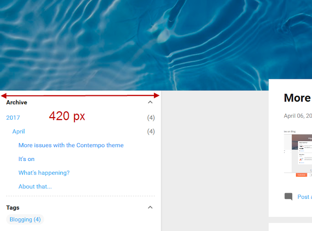
I ended up by making it wider. By default, the width is fixed - 284 px and there is no GUI to change it.
I had to tweak the HTML of the theme again, to make the sidebar's width customizable via the GUI and override those fixed minimum and maximum widths available for it.
(I'll describe the steps in another post. It will be referred to from here.)
So what changes did I make to the "Contempo" theme in this blog (including those described above)?
I haven't sorted out the issues described in my previous posts but I made some changes to handle at least one of them.
This wasn't a solution but a workaround which I can live with.
My main issue was the ugly almost empty side bar with two collapsed widgets. As I chose not to show my profile on it, it left a large chunk of space uncovered in the upper left corner of the page.
Getting the sidebar up
As the sidebar can be seen expanded on larger screens only, I've decided to keep it as it is and do something about that uncovered space for the profile.
The thing is that the sidebar consists of the top sidebar and bottom sidebar, and the former is as high as the background image (which is 480 px by default in this theme.)
So I reduced the height of the background. But here is the thing, you can reduce it to as short as 420 px. And this was still a lot, believe me. Take into account that it is 480 px by default. So from 480 to 420 is not a lot.
How about from 480 to 240? And shorter if I wish any time later?
That's what I managed to do with a small tweak to the theme's HTML.
Expanding widgets on the sidebar
As the sidebar contains to widgets at the moment: "Archive" and "Labels", it keeps them collapsed when you open the page (or a sidebar).
I wanted both of them collapsed by default.
After exploring the HTML of the theme, I learned how to do it. And did it.
So if you open the page on a big screen or the sidebar on the page on a smaller screen, you'll see these two widgets collapsed right away.
Again, I did it by tweaking the HTML of the theme and then customized it in Blogger's default theme editor.
(I'll write about it, too, in a different post. It will be referred to from here.)
Making the sidebar wider
As the sidebar now shows the widgets expanded, it might look cluttered by long blog post titles and labels. That's why I decided to experiment with its width.
I ended up by making it wider. By default, the width is fixed - 284 px and there is no GUI to change it.
I had to tweak the HTML of the theme again, to make the sidebar's width customizable via the GUI and override those fixed minimum and maximum widths available for it.
(I'll describe the steps in another post. It will be referred to from here.)
Summary
So what changes did I make to the "Contempo" theme in this blog (including those described above)?
- I have changed the background image (which looks like the header's background image in this theme).
- I have reduced the height of the background image from 480 px to 240 px (way over the allowed minimum of 420 px).
- I have increased the width of the sidebar from the fixed 284 px to 420 px.
- I have made the "Archive" and "Labels" (called "Tags" in my blog) expanded by default.


Comments
Post a Comment